This a single color at a time thing might be becoming a pattern. I never noticed that about myself. I have been thinking about the comment that my friend made about the color of the bathtub, which I have yet to finalize (thank you to everyone who voted!). I was thinking of mainly darker colors, but Adrienne suggested a soft baby blue. Hmm, with the dark ceiling in the bathroom and very masculine/ graphic feel of the space, that might be just the right touch.

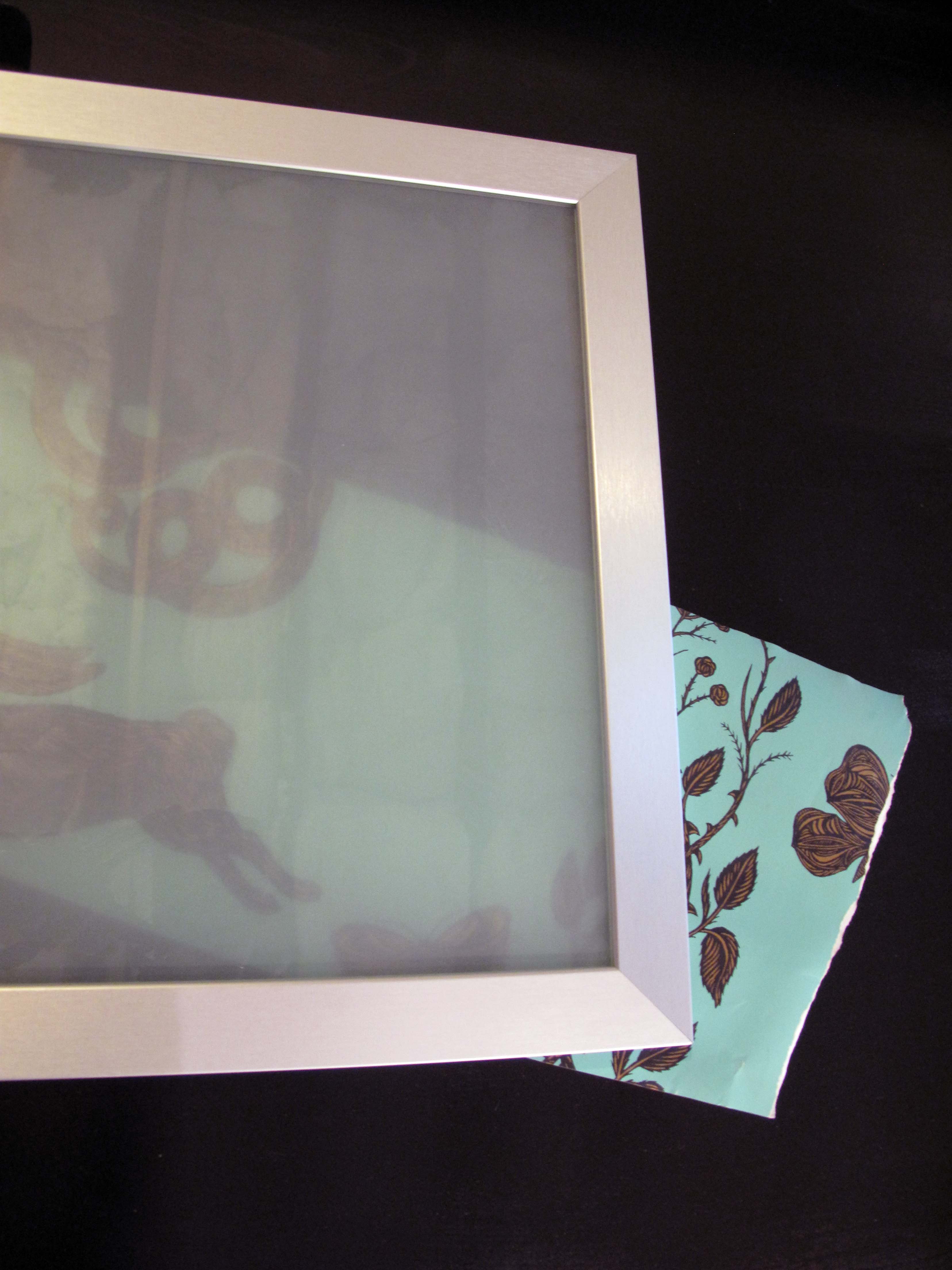
And then I was looking at the wallpaper for the small bathroom downstairs, which is more of a seafoam green, but similar vibe/color family of what I am now thinking for the upstairs bathtub color. And I realized that the wallpaper kind of goes with the very soft greenish tint of the glass in the upper row of cabinets:

Since we have a bunch left over, I thought why not line the back of the open shelves by the fridge, and maybe even the inside back wall of the upper cabinets with the wallpaper? Plus the wallpaper already has brass in it, which would go well with the mostly brass hardware.
I was originally thinking of red accents in the kitchen, but this seafoam green-bluish thing might be displacing that vision. I do want to put some plants in the kitchen, so the idea is winning me over even more. but with tinny tiny pops of red? or not?
Doesn’t this look good? Subtle soft blue-green for the dining chairs in the first kitchen, and pops of seafoam and baby blue on the shelves and on the stove. Note the brass, too.


Sources: Green Street, Canadian Home & Garden