We have missed out on the weekend of work since we were in NYC for fun. It was fabulous, as always. New York has a lot to offer, including the fact that if you are visiting, you don’t have a to do list to get to. Just relax, sleep-in, see friends. But I digress. In the three days of painting, we have made a small dent in the must get done list.
First up – I have started on the staircase wall. Benjamin Moore Revere Pewter HC 127 in matte was the winner for this space. Its neutral, but doesn’t fade back. It makes the moldings pop, and I think art should look good against it. Oh and matte because our walls are far from even up close.

Two things that weren’t fun — it took me 4.5 hours to do one side of the hallway (how??? is it the 10-foot high walls?), I used up half a gallon of paint to do that one side. There is much more wall space left and a gallon isn’t going to cut it. And there definitely needs to be a second coat of paint. At $70 a pop for Aura paint that made me cringe.

Lessons learned:
1) don’t eyeball it. calculate the square footage and estimate how much you need before going to the paint store;
2) consider getting cheaper grade paint for first coat, then do Aura as top coat.
Why Aura? I first discovered it when I painted the bathroom ceiling — it prevents moisture and mold, but can dry matte. But also! it is completely washable, even in matte. But it is expensive. Ack.
Sergey primed the dining room plaster (this wall has been completely redone since it used to be the bathroom opening). And I touched up the ceiling with primer in the small bedroom. But now looks like it was touched up, and I am wondering if I really will need to repaint the ceiling. ick. Now, the important stuff – colors.

I have taken the lead on the vision for how rooms should look, but of course I always consult with Sergey. He has vetoed things here and there, and also made suggestions that have worked out really well. But color is particularly difficult. As far as I am concerned I can paint the entire house white, and be so very happy. That’s out of the question for Sergey though, and I am cool with that.
Sergey is keen on color. He isn’t shy about it. He likes bold and likes it all over. I like color, but tend to layer it in small doses, and stick to neutrals (grays, black, and white) or at the least soft, pastel colors for larger pieces. This formula is applicable to clothes and decor.
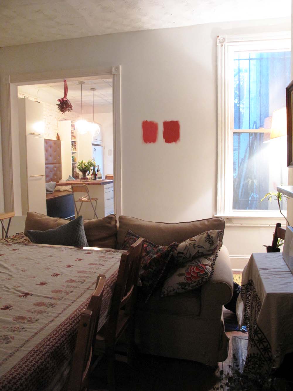
That was a long winded introduction to the idea that we are going to have a red room in the VIB. Dining room has been picked as the designate spot. This room is pretty dark–there is only one north-facing window, but even that comes out to a very narrow space between our house and the neighbor. So light colors tend to look bleak and dingy.
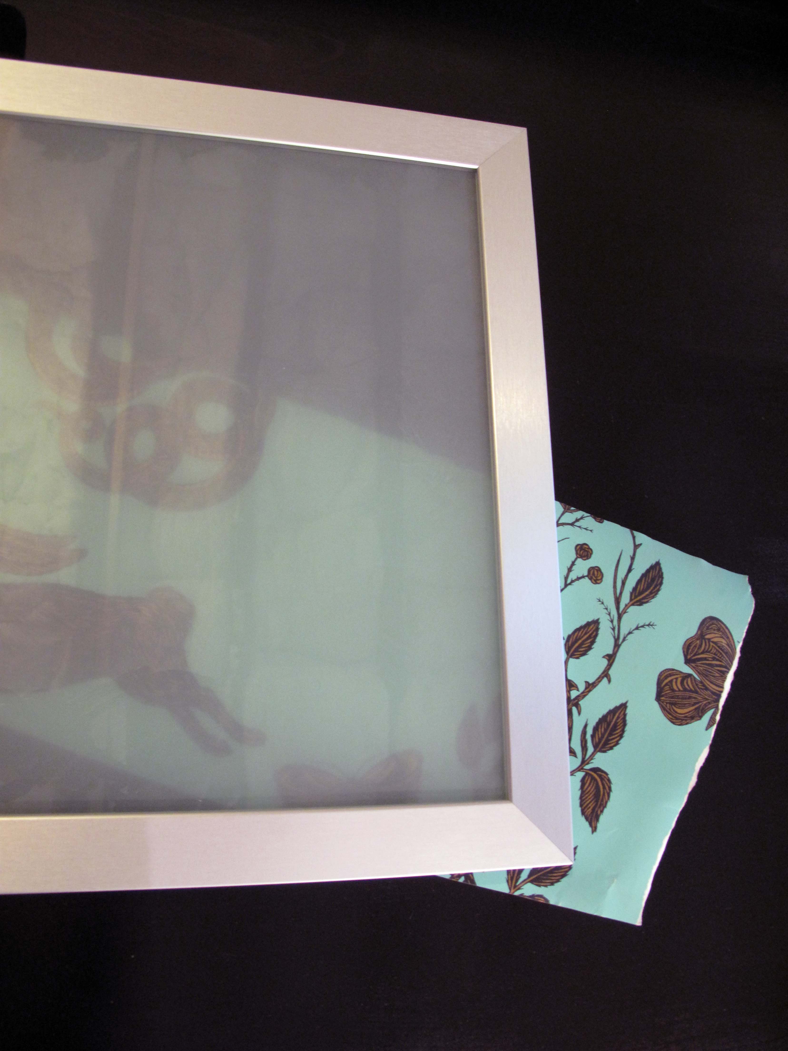
And so we are trying out some colors. But even with hues and shades of reds we are having difficulty agreeing. The four contenders clockwise Farrow & Ball Book Room Red, Benjamin Moore – Moroccan Spice, Spanish Red, Tucson Red. Revere Pewter is in the middle – that’s the color of the hallway which will be part of the room, since its not close off from the stairs.

We have narrowed it down to two – Moroccan Spice and Tucson Red. I like the former, Sergey likes the latter. yikes.


Thoughts?